How I gave my portfolio website a 2023 glow-up: The art of endless learning and growing
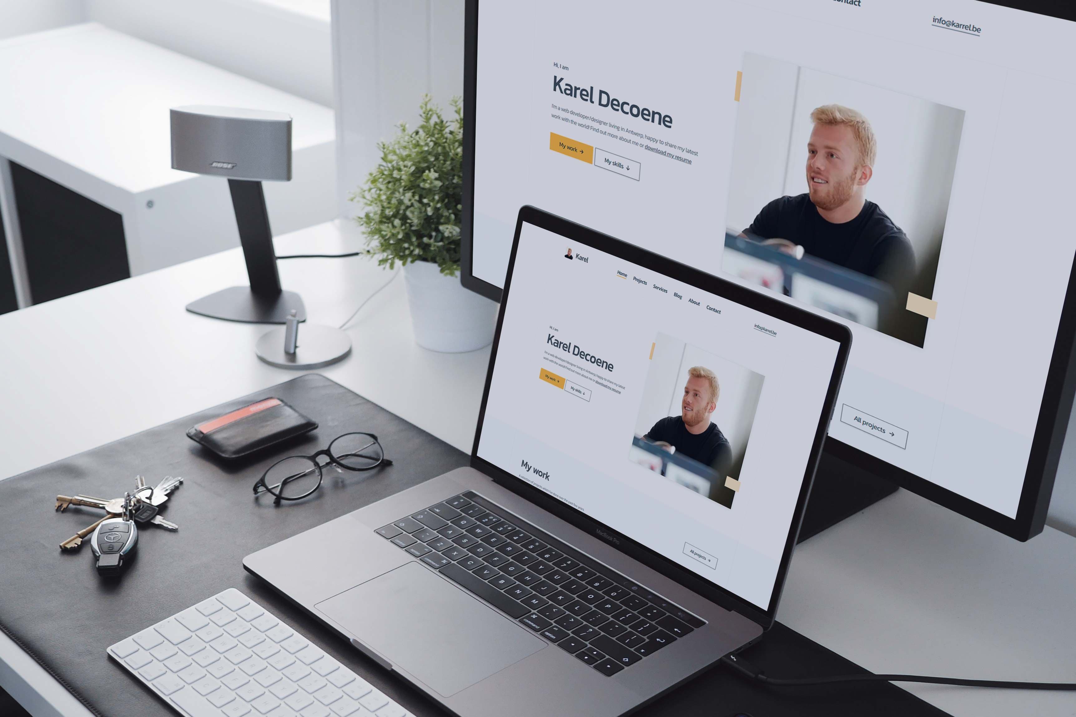
In June 2023, I decided it was high time to give my portfolio website a much-needed upgrade. This marked the third iteration in the past three years. You might wonder why I kept making these changes so frequently. Well, the reason is simple: I've been on a continuous journey of learning and growth. With each passing year, my skills in design and development have evolved significantly. Consequently, my old portfolio no longer did justice to my current abilities.
So, it made more sense to create an entirely new portfolio website from scratch. Let's dive into how I approached this revamp with the aim of making it last longer than a year:
So, it made more sense to create an entirely new portfolio website from scratch. Let's dive into how I approached this revamp with the aim of making it last longer than a year:

01. Research & Information Architecture
Before delving into the technical aspects, I needed to clarify the primary goals for this website. The central focus had to be on showcasing the projects I've worked on to date. Additionally, I had to identify what other information should be present on the website and how to organize it around this primary focus: my projects.
To assist me in this process, I utilized ChatGPT and FigJam to structure all the content into an information architecture.
To assist me in this process, I utilized ChatGPT and FigJam to structure all the content into an information architecture.
02. Low-Fidelity Wireframes
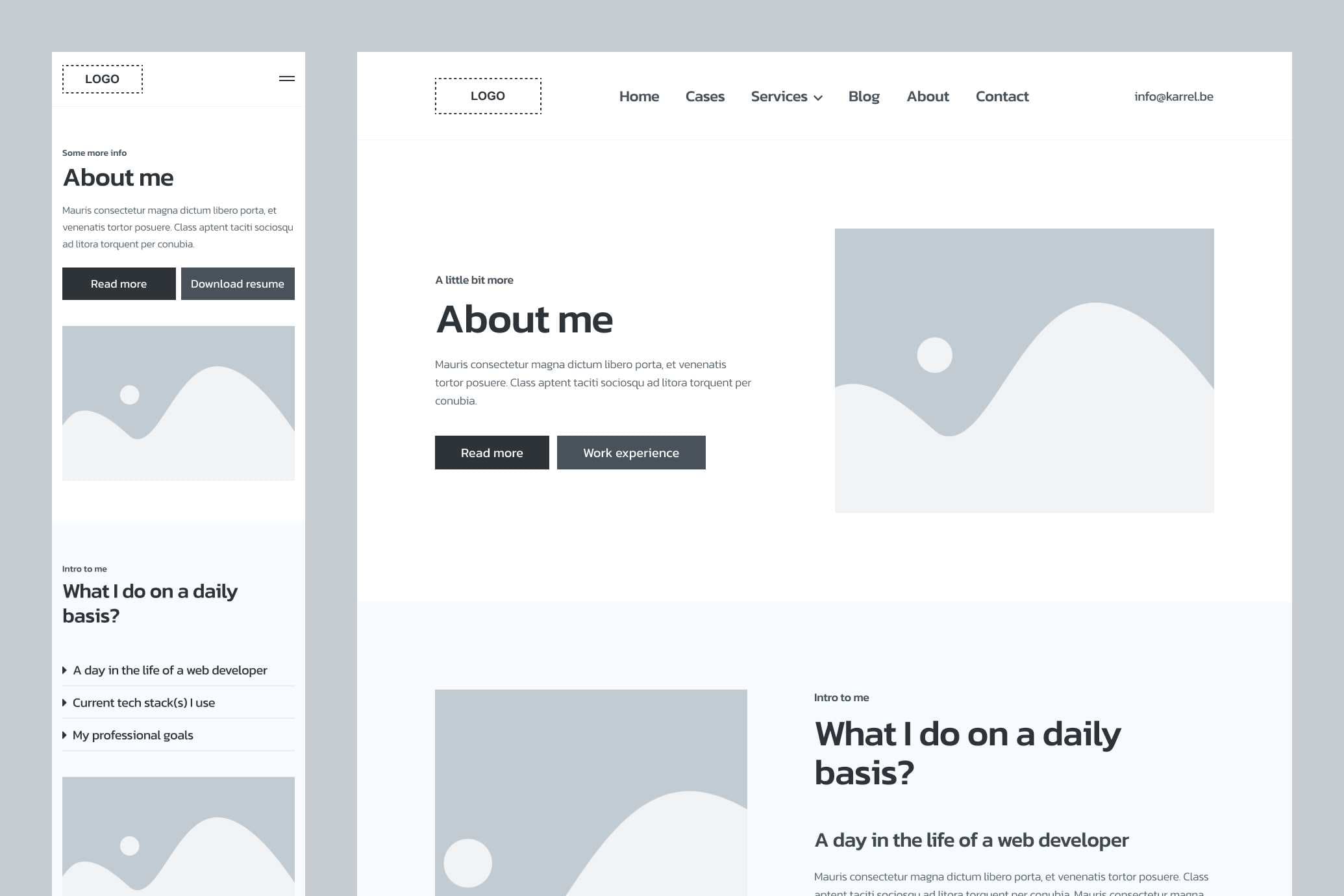
Once I had a grasp of how to organize my content, it was time to give it a visual form. I achieved this by creating low-fidelity wireframes. With a mobile-first approach, I aimed to structure the content in a way that made it easy to navigate and consume.
03. High-Fidelity Wireframes & Clickable Prototype
Low-fidelity wireframes provide a rough sketch, but it was time to refine them and transform them into a clickable prototype. This allowed me to get feedback from a friend, Tommy Buelens, who happens to be a UX designer. His insights were invaluable in further refining the wireframes. Thanks again, Tommy!

04. Design System
With a finalized structure and layout in place, it was time to establish a design system. This made working on the final designs much more efficient. The design system primarily comprised color palettes and typography choices.
05. Component Library
With the design system firmly established, I simultaneously created a component library while designing the actual components and CMS blocks. This approach adhered to the best practices of atomic design, enhancing ease and efficiency in the design process.
06. Building Pages & CMS Blocks
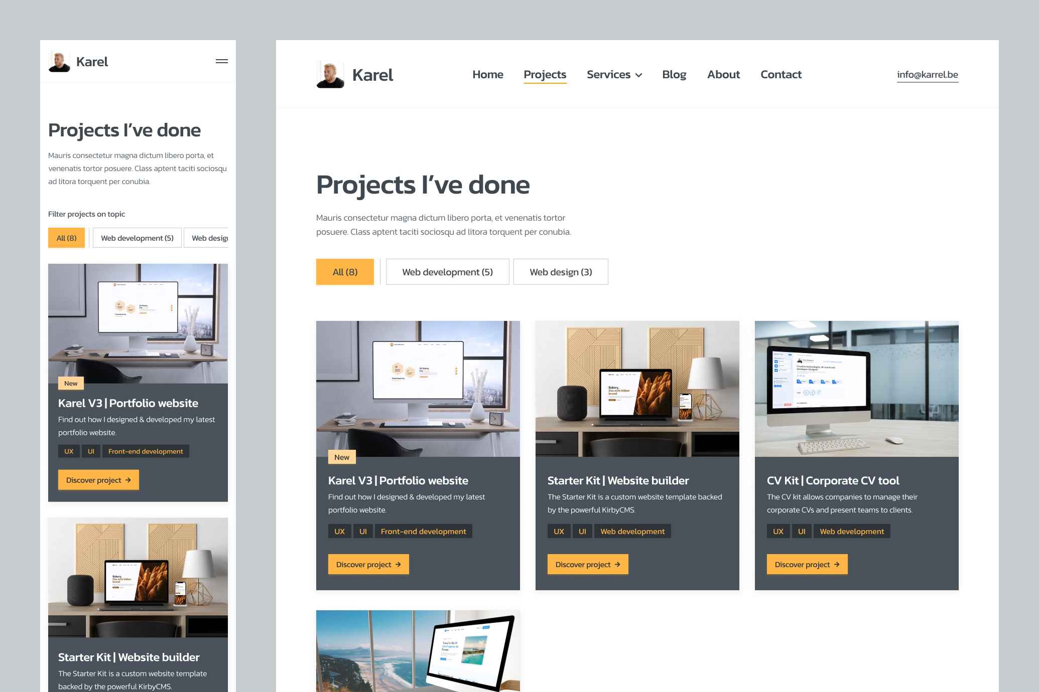
Armed with a detailed design system and layout, I swiftly transformed these high-fidelity wireframes into final designs. I meticulously considered which reusable elements, such as atoms, molecules, or organisms, should be created to ensure efficiency. These final designs were made clickable to provide clarity during development.

07. Building the KirbyCMS Backend
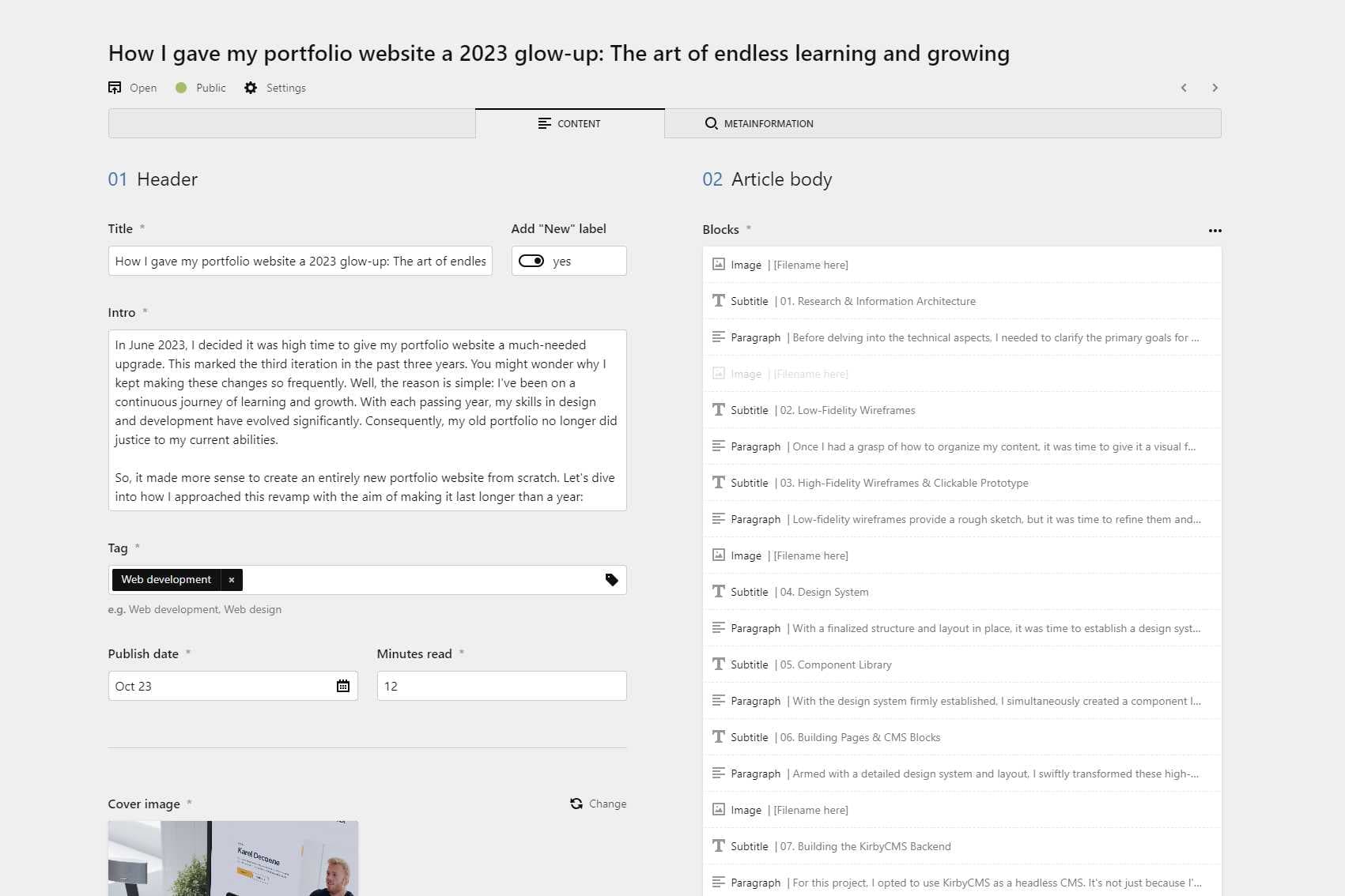
For this project, I opted to use KirbyCMS as a headless CMS. It's not just because I've had positive experiences with it, but it's also one of the most user-friendly CMS options out there, in my opinion. Moreover, it's budget-friendly for a non-commercial, fun project like this one.
I'm not getting paid to say this; I'm just a massive fan. I set up KirbyCMS in a dynamic way, allowing me to create new pages effortlessly without the need to modify any code. With everything set up, it served as a solid API endpoint to fetch all the data for the frontend.
I'm not getting paid to say this; I'm just a massive fan. I set up KirbyCMS in a dynamic way, allowing me to create new pages effortlessly without the need to modify any code. With everything set up, it served as a solid API endpoint to fetch all the data for the frontend.
08. Setting up Next.js with TypeScript and TailwindCSS
Now, it was time to tackle the frontend. I embarked on creating a new Next.js project, opting for TypeScript to add more structure to my code. Additionally, I used TailwindCSS to style my components efficiently, involving some configuration adjustments to save time down the line.
09. Frontend Components with Dynamic Data
Next, I created routes, pages, and CMS blocks as envisioned in the design. These components were designed to retrieve their data dynamically based on a fetch operation initiated at the page level. The components were crafted to be responsive, adhering to a mobile-first approach, and pixel-perfect, mirroring the design.
10. Adding Content
With both the frontend and backend in place, it was time to populate the CMS with content. Language and content creation have never been my strongest suit, so I was grateful for the assistance of my trusty friend, ChatGPT.
After numerous hours of effort, I felt that the text and images more or less matched my style and the website's purpose. While I may consider reaching out to a copywriter in the future, for now, this content will suffice.
After numerous hours of effort, I felt that the text and images more or less matched my style and the website's purpose. While I may consider reaching out to a copywriter in the future, for now, this content will suffice.

11. Hosting
Having completed the frontend and backend, and with content in place, it was time to take this project live. I chose Easyhost for hosting the PHP-based KirbyCMS backend due to its cost-efficiency. For the Next.js frontend, Vercel was the obvious choice.
12. Testing
Although I conducted extensive testing during development, I performed additional rounds of testing on the entire website after hosting. I wanted to ensure that there were no rookie mistakes lurking in my project before making it available to the public.
13. In a Nutshell
Design (91 hours) → FigJam, Figma
Development (105 hours) → KirbyCMS, Next.js, React, TypeScript, TailwindCSS
Other tools I've used → Trello, Toggl, Notion, ChatGPT
V2 Will Be Coming Soon
I still have some "nice-to-have" features and improvements in mind for this project, including a dark mode, contact form and more efficient data fetching. Until those are implemented, this version will serve as the MVP.
Links to resources
Questions or just want to connect?
Don't hesitate to send me a message.