Pole Position V2
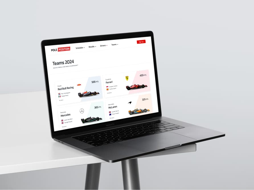
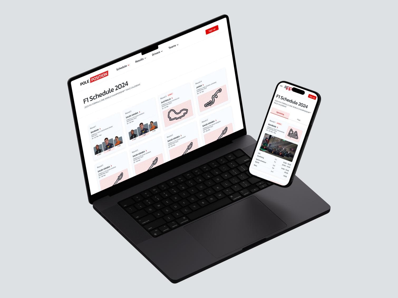
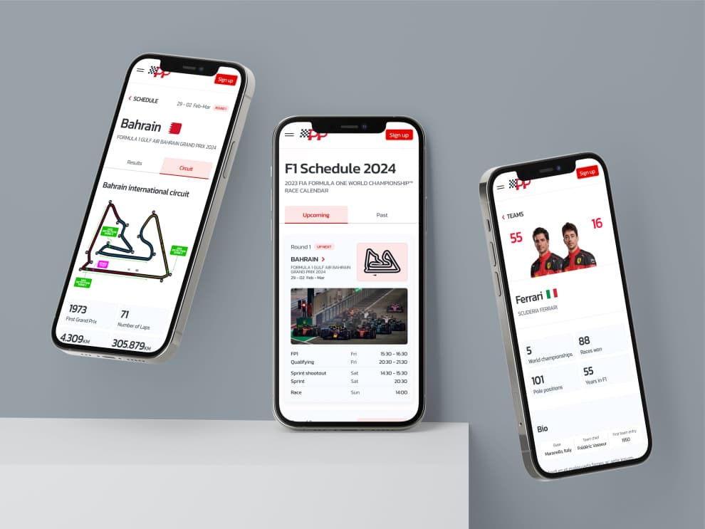
Pole Position is an F1 blog offering detailed team and driver info, standings, and historic results. Originally my bachelor project, I've recently updated it to showcase my enhanced design skills with a more polished and appealing version.
Technologies/Frameworks used
Figma
Technologies/Frameworks used
Figma
Behind the scenes
How did I tackle this project?
Pole Position – an F1 hub reborn
Pole Position started as my bachelor project a few years ago. It was a blog for F1 fans with team info, driver stats, standings, and historic results. Recently, I revisited it with a fresh goal: not to rebuild the code, but to redesign it.
I wanted to see how far my UI design skills had come. By reworking Pole Position in Figma, I gave the project a cleaner look, sharper structure, and a more engaging feel. The result? A polished version that reflects my current design style and attention to detail.
This was a hobby project and is not associated with F1 in any way.
Features
- Grand prix info
- Driver/team standings
- Historic results
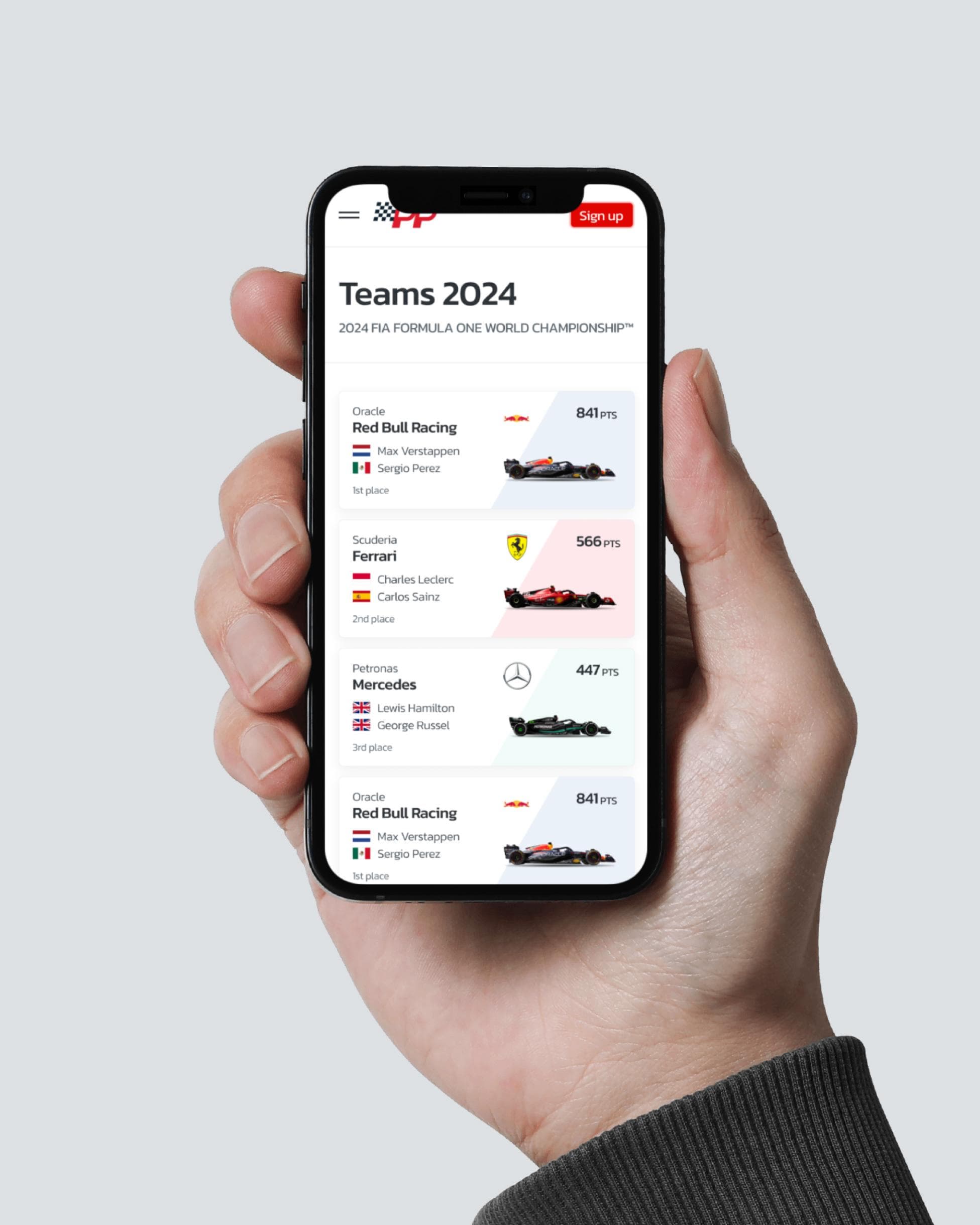
From sketches to polished UI
When reworking Pole Position, I approached it like a real design project in Figma, step by step.
Wireframes
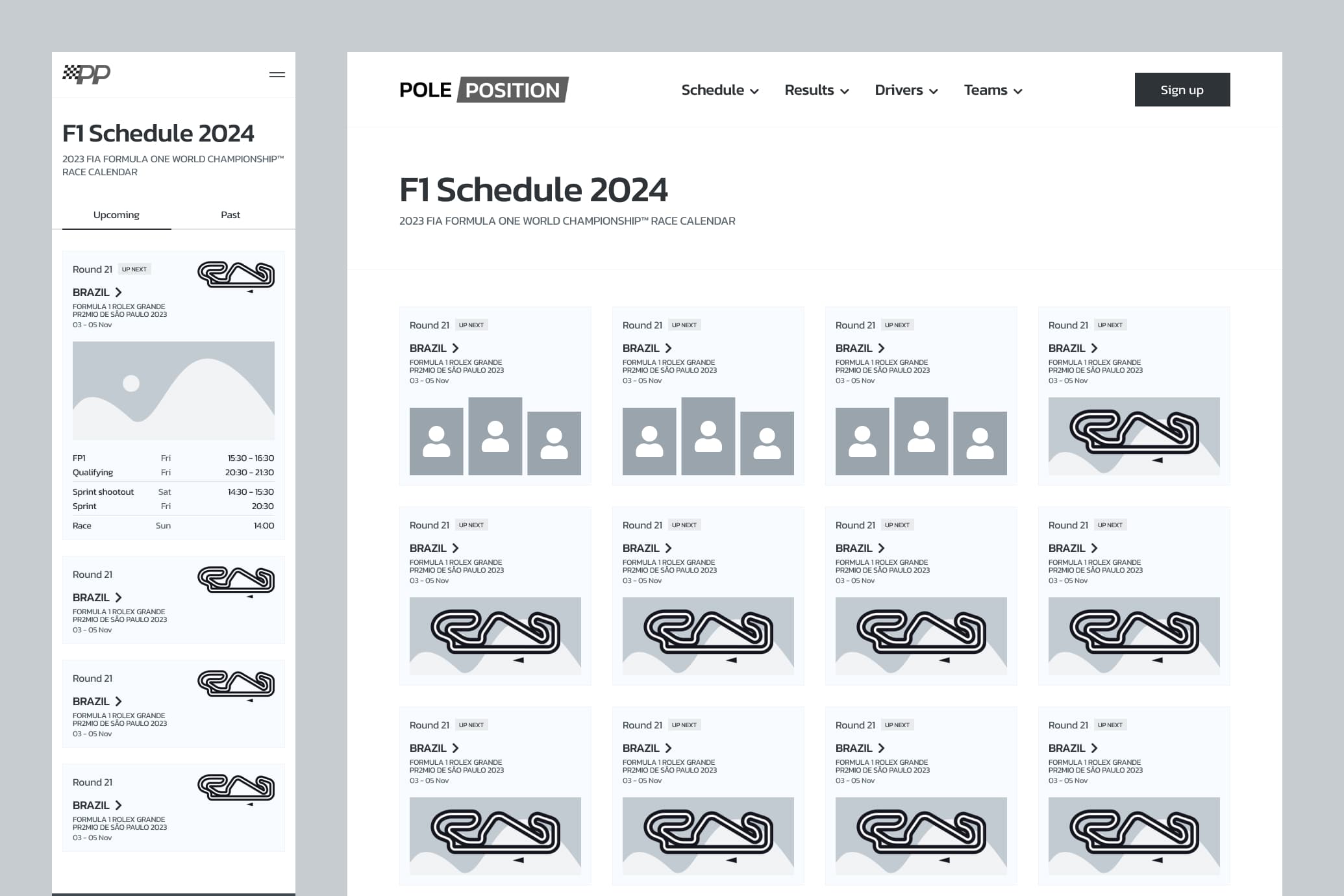
I started simple. Low-fidelity wireframes helped me rethink the layouts, navigation, and hierarchy before diving into details.
Minimal design system
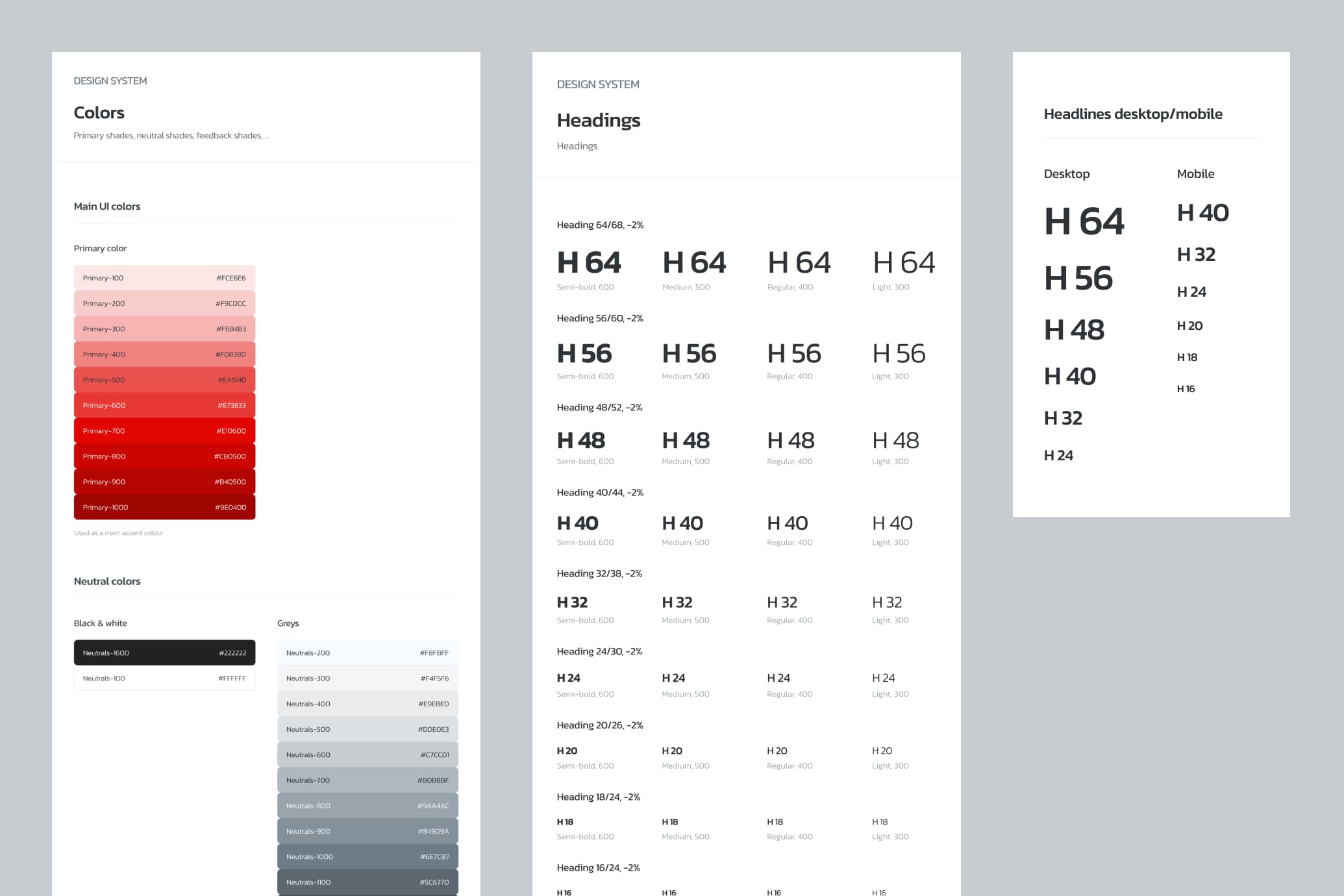
To keep things consistent, I built a small design system inside Figma: colors and typography. Nothing too heavy, just the basics I needed to keep the project clean and unified.
Components & reusable blocks
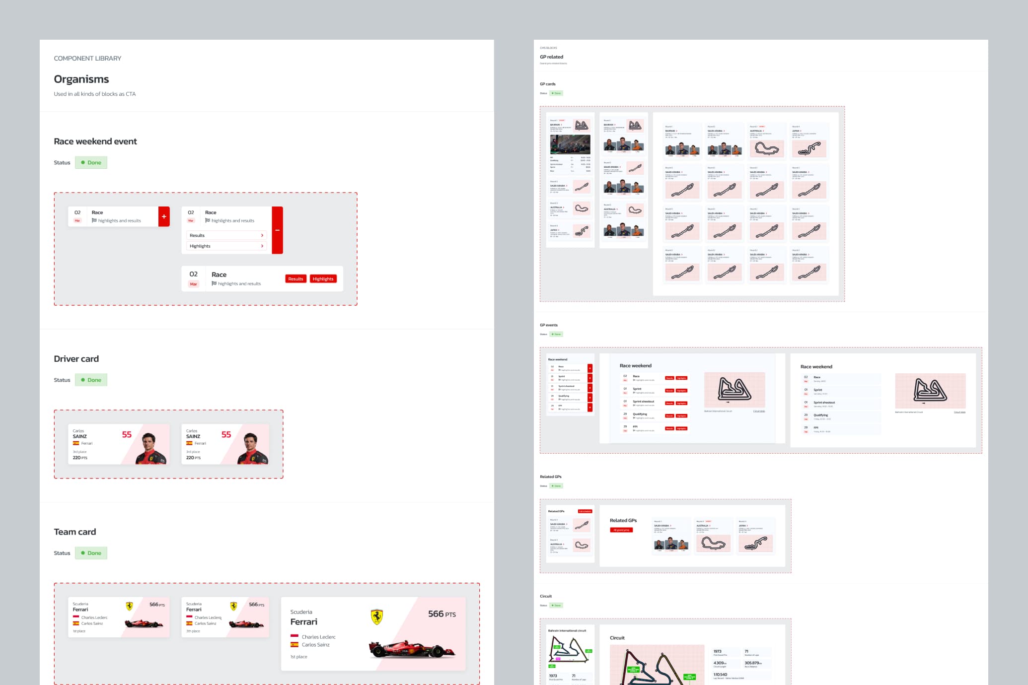
Next, I turned repeated elements (cards, buttons, nav items) into Figma components. This made it much easier to keep everything aligned and scalable.
Final designs
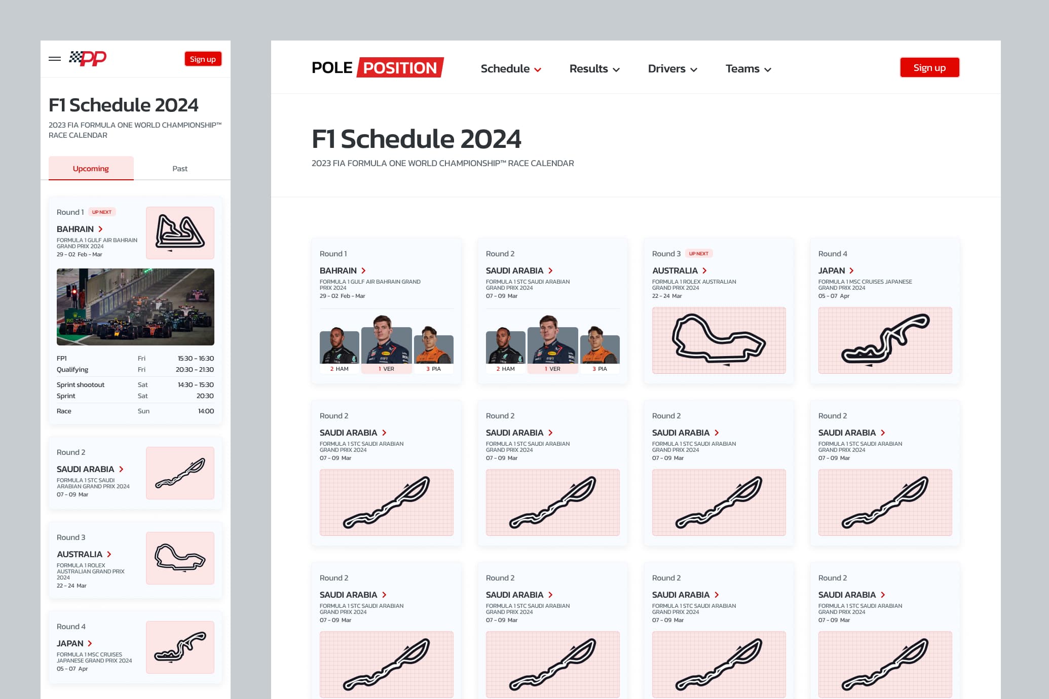
With the system in place, I moved to the polished UI. Here I pushed for a modern but minimal look: bold headlines, clear data displays, and a balanced color scheme that fits the F1 vibe.
Reflection
The full journey shows how I now think about design: start structured, stay consistent, and aim for clarity.
Next project
All projectsQuestions or just want to connect?
Don't hesitate to send me a message.
